
When I click the chain icon, it brings me to the post and I can see the reply comment, but not my own (which for me adds a lot of needed context for interpreting the reply). Is this normal?


When I click the chain icon, it brings me to the post and I can see the reply comment, but not my own (which for me adds a lot of needed context for interpreting the reply). Is this normal?


I’m guessing it is in settings? Also a jerboa user. But I am seeing the comment images at a reasonable size. I’m using the dark theme, and I think I changed the font size, but it’s been almost a month since I first installed, so not super sure.


Thanks, I’ll give that a try.


Yeah, I posted a link to a song and asked if anyone else liked it, but the post was removed as off-topic. So I guess that was a stupid question.


I couldn’t remember the word for bookmark! Thank you! I tried to compensate by over describing, lol


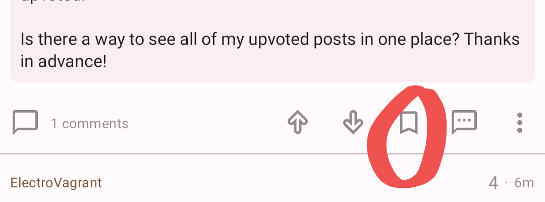
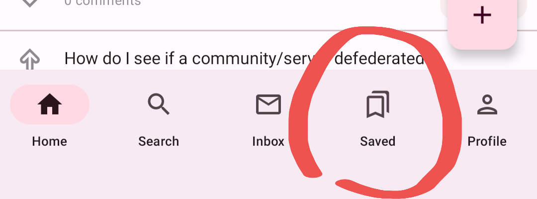
There is a flag/banner (ribbon?) icon below posts (and comments), if you click the icon, the post (or comment) will be visible in your in-app saved items (bottom toolbar, looks similar to the save icon). I’ll post screenshots.
Here’s the icon to save a post/comment:

Here’s the bottom ribbon icon to view saved items:

The screenshots make this post confusing for me, lol! Every time I edit I get confused about where to click! Sorry for the poor cropping of the images.
Yeah, the context button doesn’t seem to add the context that I find helpful. I agree it should show your comment and replies to your comment (and parent comment, if applicable? Although I think that should show as a collapsed portion that you can expand as desired).