
Note that there still have been no studies on its efficacy. At worst, it is a great font to avoid ambiguity between characters.
Note that there still have been no studies on its efficacy. At worst, it is a great font to avoid ambiguity between characters.
I find it ironic that their website has extremely low contrasting colors making it very hard to read.
(Look at the top left for the worst example)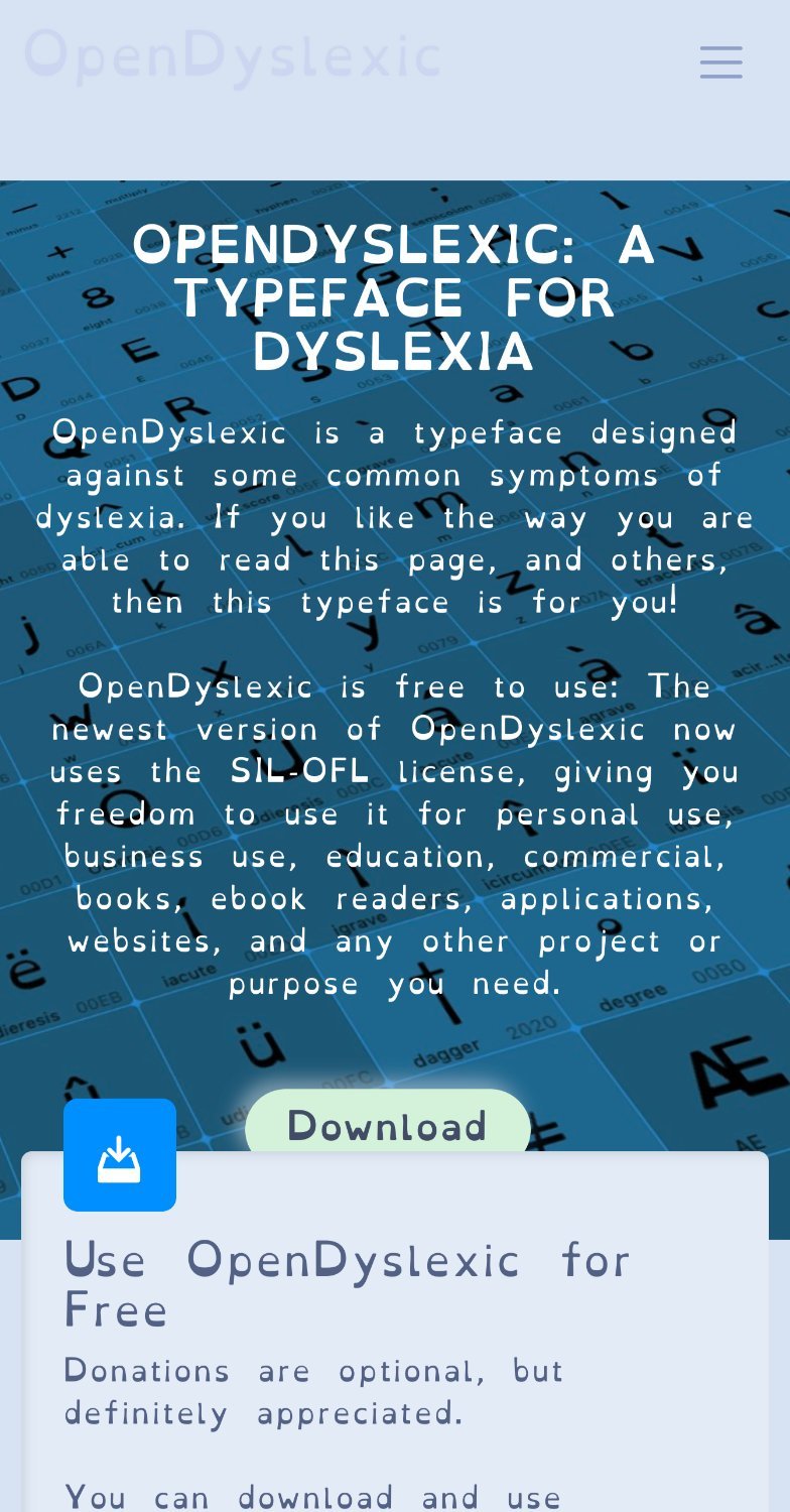
Yeah it’s almost impossible to read